USAGE
Conditional styling
How to do conditional styling with tailwindest.
Use toggle, rotary, variants functions for easy conditional styling.
toggle: change the style by abooleanconditionrotary: change the style by some conditionsvariants: complex combination of categorized conditions
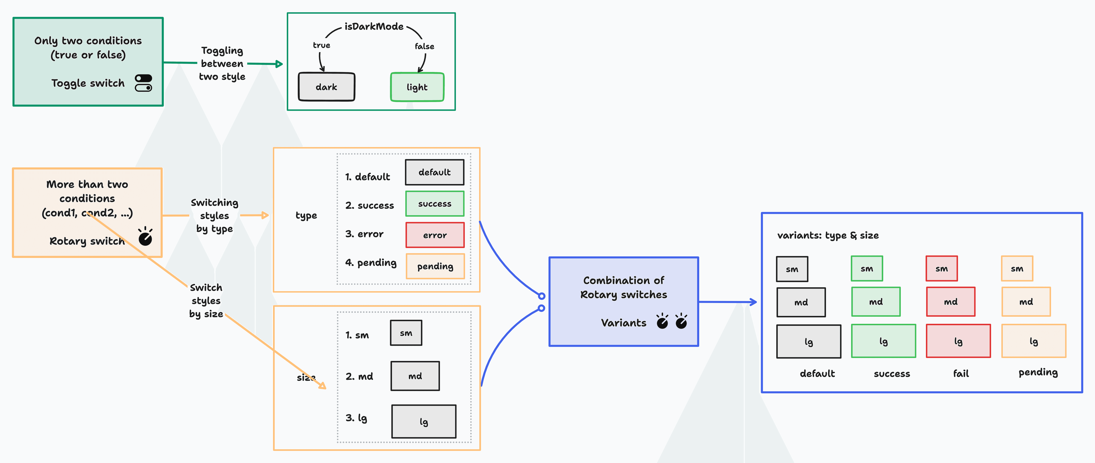
Toggle switch - toggle
The toggle function is used to change the style by a single boolean condition. You should define a style for each of the true and false conditions and optionally define a common style for true and false conditions.
Mind concept
Implementation - toggle
Define themeBtn style, using toggle.
const themeBtn = tw.toggle({
    base: {
        // Base styles
    },
    truthy: {
        backgroundColor: "bg-black",
    },
    falsy: {
        backgroundColor: "bg-white",
    },
})
Use it in component.
const ThemeBtn = () => {
const [isDarkMode, setIsDarkMode] = useState(false)
return (
<button className={themeBtn.class(isDarkMode)}>
{isDarkMode ? "light" : "dark"}
</button>
)
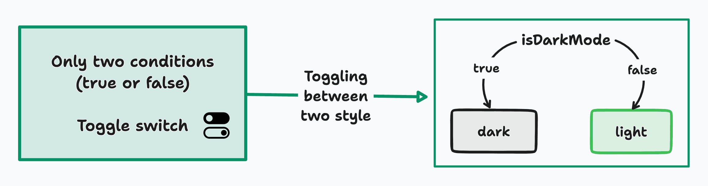
}Rotary switch - rotary
Mind concept - type
Implementation
Define button with type, "default" | "success" | "error" | "pending" variations.
const button = tw.rotary({
    base: {
        // define common style for button type
    },
    default: {
        borderColor: "border-neutral-100",
    },
    error: {
        borderColor: "border-red-400",
    },
    pending: {
        borderColor: "border-yellow-400",
    },
    success: {
        borderColor: "border-green-400",
    },
})
Usage
Use it in component.
Use default parameter, to set default variant value
import { type GetVariants } from "tailwindest"
const Button = ({
children,
onClick,
type = "default",
}: React.PropsWithChildren<{
type?: GetVariants<typeof button>
onClick: () => void
}>) => {
return (
<button onClick={onClick} className={button.class(type)}>
{children}
</button>
)
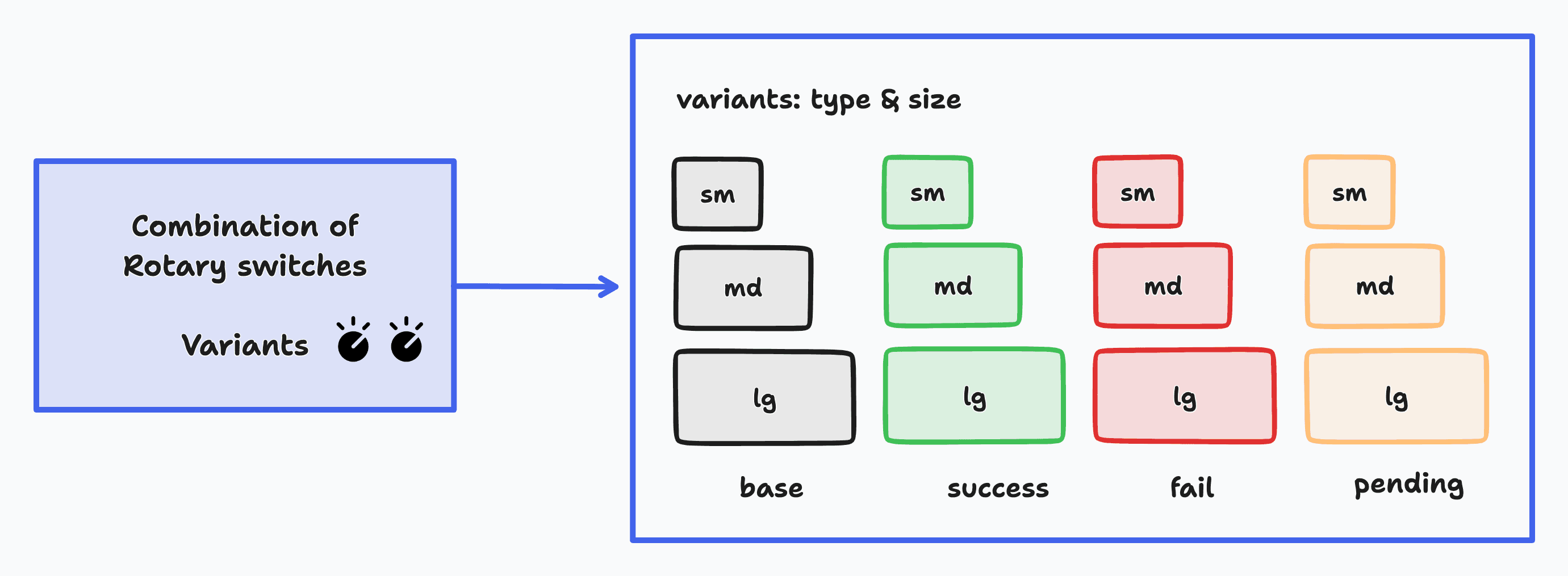
}Combination of categorized conditions - variants
Mind concept - type & size
Implementation
Define complex variants with variants
const button = tw.variants({
    base: {
        // Define base styles
    },

    variants: {
        type: {
            default: {
                borderColor: "border-neutral-100",
            },
            error: {
                borderColor: "border-red-400",
            },
            pending: {
                borderColor: "border-yellow-400",
            },
            success: {
                borderColor: "border-green-400",
            },
        },
        size: {
            sm: {
                fontSize: "text-sm",
            },
            md: {
                fontSize: "text-base",
            },
            lg: {
                fontSize: "text-lg",
            },
        },
    },
})
Usage
Use it in component.
Use default parameter, to set default variant option
import { type GetVariants } from "tailwindest"

interface ButtonProps extends GetVariants<typeof button> {
    children: ReactNode
    onClick: () => void
}

const Button = ({
    children,
    onClick,
    size = "md",
    type = "default",
}: ButtonProps) => {
    return (
        <button
            onClick={onClick}
            className={button.class({
                type,
                size,
            })}
        >
            {children}
        </button>
    )
}
Use universal button.
const SomeComponent = () => {
    return (
        <div>
            <Button size="lg" type="success" light onClick={welcome}>
                Succeeded
            </Button>
        </div>
    )
}